
US Open Broadcast Graphics
Overview
Our team was asked to create a full redesign of the US Open Tennis World Feed Broadcast graphics. This included a large number of shells for both interfaced and free form graphics.
My Role
Conduct research to better understand the scoring system of tennis and the way graphics are displayed during broadcast
Assess what data is required in a standard scorebug, including all possible variables
Generate mockups to explain design intentions
Produce high-fidelity prototype to present to the client
The Challenge
The current package, originally created in 2015 and tweaked in 2018, felt clunky. The USTA was looking for something modern and clean.
Designs Needed
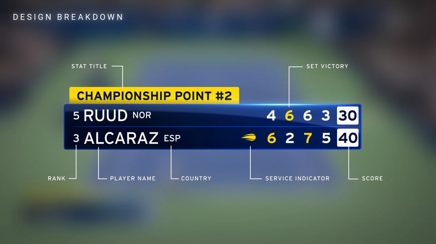
Scorebug
Scoreboard
Match Title
Full Page Stats
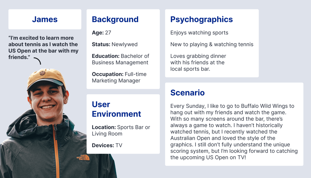
User Persona
Due to the nature of the project, we knew most of our users would be watching our graphics on a TV. One of our Directors said something during one of our brainstorming sessions that stuck with me. "How do we serve the guy watching the game from the back of the bar?" This was a scenario I hadn't considered, so I wanted to explore it further.

My Process
Before I began designing, I conducted research on the game of tennis. Being new to the sport, I needed more context before I could design something relevant and meaningful. I learned the basics of the tennis scoring system, what an Ace and a Break Point are, and the difference between a game, set and match.
After the research phase, I began gathering reference images and creating a board using the app PureRef. This not only gave me ideas to start with, but also kept me from steering of track in the design process. I knew the client liked the look of the Australian Open, so I took note of what worked well for their broadcast package.
From there, I began designing a look for the scorebug. Knowing the bug would get the most airtime, I wanted to lock the design and function of the bug first, and then work on designing the other elements to fit that look.
My goal was to create a simple and elegant design system that would be easy to read for new tennis fans (myself included), while still retaining familiarity with the established fanbase.
Reference Images
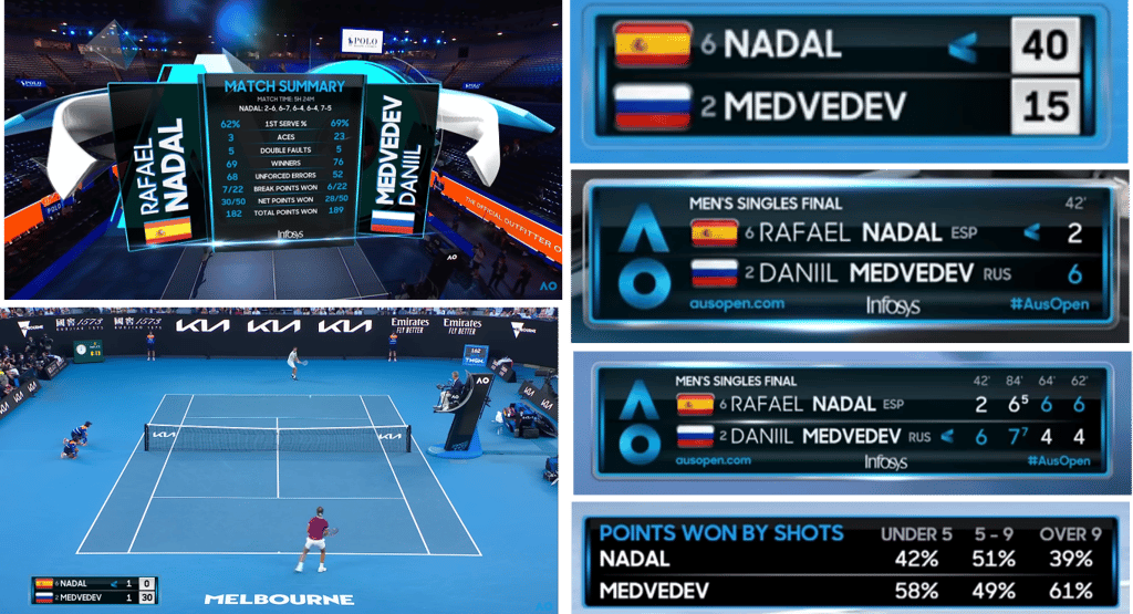
Knowing the client wanted to emulate the look of the Australian Open, it made sense to watch through a match and take notes on the design and functionality of the scoring system and graphics package. As I watched, I took a few screenshots and organized them using PureRef.
My biggest takeaways from this research was how clean the "glass and metal" looked, the tasteful use of an optical flair to draw the fan's eye to the data, and also how they reinforced the branding by using the "A" of the Australian Open logo as the service indicator.


Scorebug
Score Board


Match Title
Full Page Stats
Side Slab Stats