Overview
This project focuses on refining the UX and UI of the Goodreads mobile app by addressing accessibility issues, improving usability, and ensuring consistency in visual design.
Challenges & Solutions
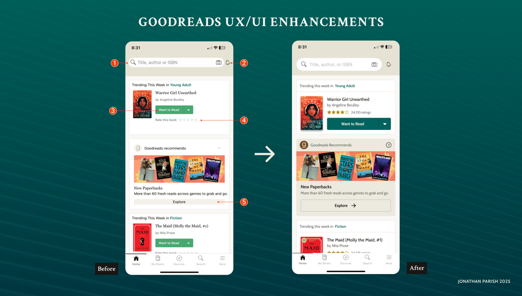
Through a detailed audit of the interface, I identified several usability and accessibility concerns and made the following enhancements:
Search Bar Tap Target – The original tap target for the search bar was too small, making it difficult to interact with. I increased its height to the recommended 44px for better accessibility.
Notifications Icon Tap Target – The tap area did not meet the recommended 44px size, which could cause frustration for users. I adjusted it to improve ease of use.
Contrast Compliance – The background color of the "Want to Read" button did not meet AA contrast requirements. I updated it to ensure better readability.
Book Ratings Logic – The interface previously allowed users to rate a book they hadn’t read, which could lead to inaccurate ratings. I updated this section to display the book’s existing rating instead.
Sponsored Ad Button Consistency – The button style on sponsored ads was inconsistent with the rest of the UI. I updated it to align with the app’s design system.
Additionally, I refined the overall sizing and spacing of elements to create a more balanced and visually structured layout.
Impact
These improvements enhance the usability and accessibility of the Goodreads app, making interactions smoother and more intuitive while maintaining brand consistency.