Platform: Mobile Web
Focus: Checkout Flow UX
Project Overview
Relias Academy offers online continuing education for healthcare professionals. With mobile traffic on the rise, we aimed to streamline the checkout experience on smaller screens—making it faster, more intuitive, and more inclusive.
Goals
Optimize the mobile checkout flow for clarity and ease of use
Introduce Google Pay to simplify transactions
Ensure WCAG-compliant accessibility, including tap targets and contrast
My Role
As the UX Designer, I was responsible for:
Auditing the existing mobile flow
Designing and prototyping improvements
Collaborating with engineering and product to implement updates
Ensuring accessibility standards were met throughout the process
Key Improvements
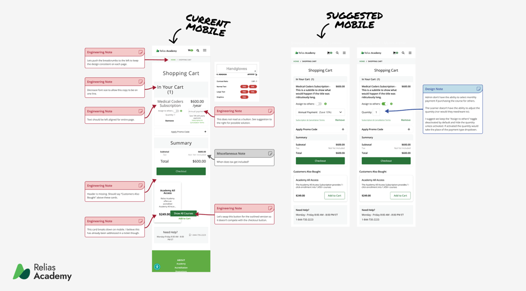
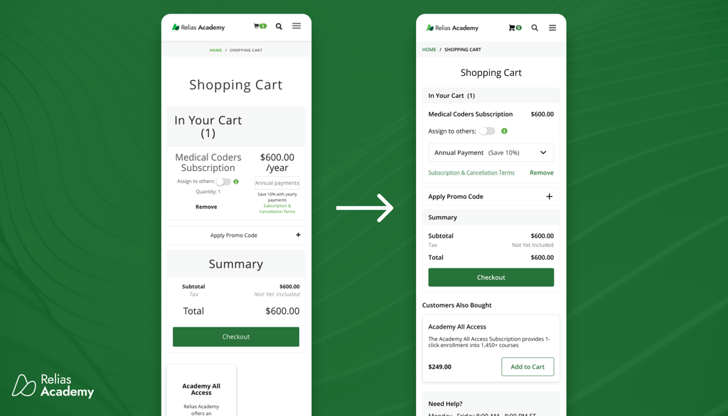
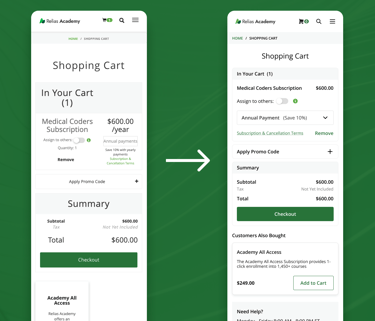
Simplified Checkout UI. We reduced cognitive load by restructuring content, aligning text, and reworking layout spacing. I created annotated mockups (see below) to guide the dev team on adjustments and design intent.
Google Pay Integration. We added support for Google Pay, which significantly improved checkout speed. Post-launch user feedback indicated high satisfaction with this update.
Accessibility Upgrades. Every change was made with accessibility in mind:
Contrast ratios verified to meet WCAG AA
Touch targets adjusted for tap-friendly interaction
Clear, consistent labeling and hierarchy
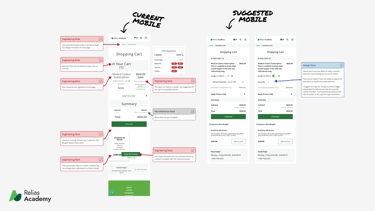
Before & After
These visuals show the transformation from the original mobile experience to the optimized version, including engineering and design notes to explain decisions and constraints.
Case Study: Mobile Checkout Optimization for Relias Academy